Visualizing Gene Expression Profiles with Multidimensional Scaling
dementia R-stats data-visualization unsupervised-methods gene-expression RNA-seq Hi everyone! This is the second installment in my quest to blog my way through a Master’s thesis project (Predictive Analytics, Northwestern). In the inaugural post, I loaded and saved the gene expression data for the 377 brain samples in the Allen Institute for Brain Science’s Aging, Dementia, & TBI Study dataset. I’ve messed around with the data quite a bit since then and it seemed like a good time to share some of the things I’ve learned so far. Just to remind you: The ultimate goal of this project is to (somehow) combine this gene expression data with other kinds of data available for these samples (neuropathological measurements, demographic information) in models of dementia status (“Dementia” versus “No Dementia”). Most likely these final models will be linear (AKA logistic regression).
This is the first of a couple of posts about exploratory analysis of gene expression data, including identifying differentially expressed genes. In this case, those are genes that are up- or down-regulated in samples from donors with dementia versus without it. The expression levels of such genes (or groups/clusters of genes) would be good candidates to include as predictors in the final models. Before we get to that, though, I thought I’d try out a way of visualizing high-dimensional data. It’s an unsupervised learning method called multidimensional scaling and, as I hope to show you, it produces some interesting results on this data.
You can find a JupyterLab notebook version of this post in the repo for this project on GitHub.
Covered here:
It’s a lot…
- Loading the edgeR and limma libraries for differential gene expression analysis from Bioconductor;
- Final preparations & a brief exploration of the gene-sample matrix of counts;
- Getting the dementia status and other info about the sample donors;
- Filtering the data to remove non-expressed and minimally-expressed genes;
- Between-sample normalization; and,
- Visualization of gene expression profiles using multidimensional scaling (using
plotlyfor the first time!).
Let’s get started!
Loading the edgeR and limma libraries
Bioconductor is an open-source project for developing R tools to analyze high-throughput genetic/genomic data. There are a few different libraries for performing differential gene expression analysis but I will be using edgeR here. We need to get both the edgeR library and its dependency, limma, from the Bioconductor website using the biocLite() installer.
# this gets bioconductor & dependencies
source("http://bioconductor.org/biocLite.R")
biocLite()

# Now get packages
biocLite(c('edgeR', 'limma'))

# load libraries
library(data.table)    # i/o
library(edgeR)         # DGE (also loads dependencies)
library(plotly)        # Awesome 3D interactive plots
Load & prep count matrix
Ok. After last time, I have a matrix stored in a .csv file that has the estimated number of mRNA transcripts (AKA “the expression level” or “count”) for each of 50,283 genes per sample. That’s a 50,283x377 matrix of mRNA counts. Here we load the count matrix from the local copy I made and get it in shape to use with edgeR. The DGEList() object we construct for the edgeR library requires the row names to be the gene names and the column names to be the sample names. Somehow, an ‘X’ got added to the front of each of the column names so I remove that here, too.
raw_read_counts <- data.frame(read.csv('C:/Users/Rebecca/Documents/NU_MSPA/thesis/data/raw_read_counts.csv'))

# make 'gene_id' row names
rownames(raw_read_counts) <- raw_read_counts$gene_id
raw_read_counts$gene_id <- NULL

# Remove X from column names
colnames(raw_read_counts) <- substring(colnames(raw_read_counts), 2)
dim(raw_read_counts)

head(names(raw_read_counts), 10)
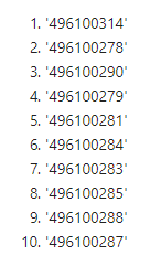
The entire collection of counts for a single sample is called a library. The expression levels in our count matrix, raw_read_counts, are dependent, in part, on the total library size. We can look at the library sizes of our samples by summing down the columns in our dataframe. These are in millions of reads.
# sum down columns to get library sizes (in millions of reads)
lib_sizes <- (colSums(raw_read_counts))/1e06
summary(lib_sizes)

We can see that there’s quite a bit of variability in library sizes among the samples.
barplot(lib_sizes,
        border = 'magenta4',
        col = 'magenta4',
        xaxt = 'n',
        ylab = 'library size (millions of counts)')
mtext(side = 1, text = 'samples', line = 0.5)
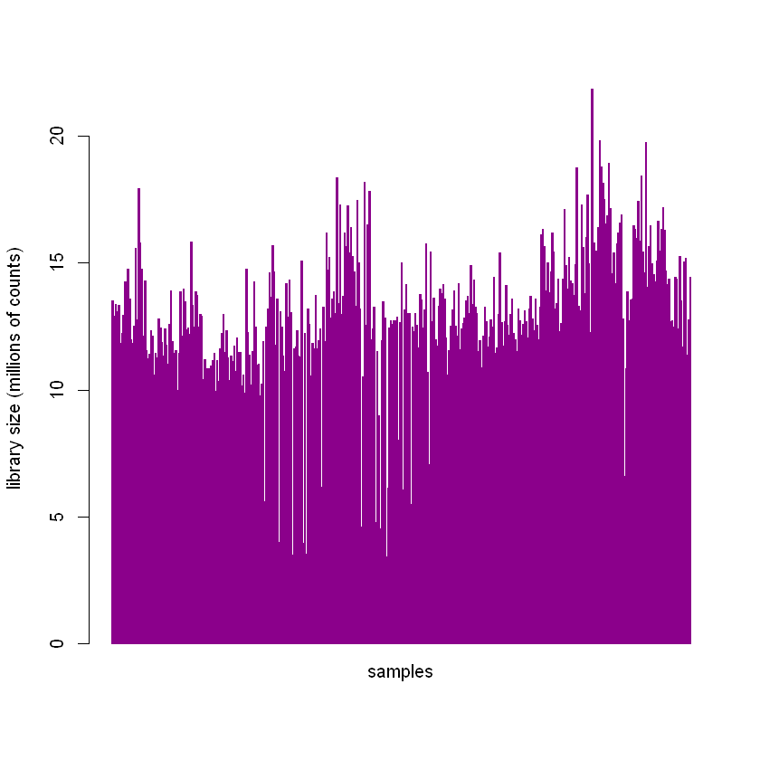
The between-sample normalization procedure discussed later in the post is performed, in part, to account for different library sizes.
Get the donor dementia status for the samples
The DGElist() object used by the edgeR package will contain both the matrix of counts and the “sample type”, which in our case is the dementia status (“Dementia” or “No Dementia”) of the donor the sample came from. This status is contained in the act_demented variable in the donor information table available from the study website download page.
# Get donor info
donor_files <- data.frame(fread('http://aging.brain-map.org/api/v2/data/query.csv?criteria=model::ApiTbiDonorDetail,rma::options[num_rows$eqall]'))
dim(donor_files)
names(donor_files)
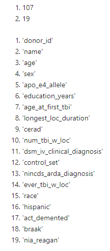
We have 107 donors with 107 dementia statuses (among other variables) in donor_files. We need to match those statuses to the 377 brain samples that we have counts for in raw_read_counts. The columns in our count matrix are labeled using rnaseq_profile_id numbers that we got from the same table we got the links from to load the data in the last post about this project. By merging that table (data_files) with the donor_info table on the shared variable donor_id, we now have act_demented for each brain sample.
# Get TBI_data_files.csv
data_files <- data.frame(fread('http://aging.brain-map.org/data/tbi_data_files.csv'))

# merge on donor_id
sample_info <- merge(data_files, donor_files, by = 'donor_id', all = TRUE)
dim(sample_info)

SANITY CHECK
It would not be good if we incorrectly matched the gene expression profiles in raw_read_counts with the dementia statuses in act_demented. We need to check that the columns in the count matrix match the rows in the new sample_info dataframe we just made. As mentioned, in the last blog post, we used data_files to load the raw counts from each sample into a dataframe by looping through the links in one of its columns. We pulled out the rnaseq_profile_id from each entry in that table to be the column name in raw_read_counts. Since we did not sort anything, they should both be in the same order (only one’s a horizontal vector and the other a vertical one); but before we pull act_demented out of sample_info to use in the analysis, I want to double check the order.
To do that, we’ll take advantage of the fact that rnaseq_profile_id is a unique 9 digit number for each sample. We’ll add a column to sample_info that consists of the column names from the count matrix (originally derived from the variable rnaseq_profile_id). We can subtract the rnaseq_profile_id column from sample_info from the column names and put that result in a new column, order_check. If the values in the columns match, the result should be zero for that sample. We can count the number of zeros in the order_check column and it should equal the number of samples we have (377) if everything’s in the right order.
# add gene matrix colnames as a column to sample_info; subtract and sum to check order
sample_info$gene_matrix_cols = colnames(raw_read_counts)
sample_info$order_check <- (as.numeric(sample_info$gene_matrix_cols) - as.numeric(sample_info$rnaseq_profile_id))
sum(sample_info$order_check == 0)
377
It looks like everything’s in order! We can pull out the dementia status for each of the samples.
# get target variable act_demented
dementia_status <- t(sample_info$act_demented)
Filtering gene expression data
We begin by putting the counts and dementia statuses into an edgeR DGEList() object.
# puts counts into 'counts' & group into 'samples'
DGE_list <- DGEList(raw_read_counts, group = dementia_status)
The count matrix is now in DGE_list$counts. We want to limit our focus to only genes that are expressed in a sufficient number of samples. Here, we filter the data so that we only keep genes with more than 2 counts per million in at least 10 samples.
# filter out any genes with fewer than 1 read/million in at least 10 samples
filtered_counts <- DGE_list[rowSums(1e+06*DGE_list$counts/expandAsMatrix(DGE_list$samples$lib.size, dim(raw_read_counts))>2)>=10,]
dim(filtered_counts)

Notice how that reduces the set of genes by more than 50%. This has the effect of filtering out any genes that have zero counts in all the samples (AKA non-expressed genes) as well.
Between-Sample Normalization
Why it’s important
Earlier, we noted the variability in library size among the 377 samples. Ideally, each of the libraries would have the same size so that relative differences in the expression of a gene among the samples are the true differences. This is in contrast to the real situation we have, which is that the differences are some unknown combination of subtle technical differences in how the samples were handled (which we don’t care about) and nifty biological differences (which are sort of the point of the whole thing).
Issues with count data
Because of the dependency of the count values on library size, we have to try to normalize for it. Normally, we’d divide the samples by their library sizes but this can have some unwanted effects on count data. In our case, for example, if there were a set of genes in one sample that were very highly (and possibly artificially) expressed, it can result in all the other genes in the sample having substantially (and also artifically) lower relative counts. In a sense, we might think of this kind of normalization as saying “Ok, we’re going to have the same total space for each sample’s expression count data to fit in and we’ll divvy it up proportionally to what’s in the original sample.” But when you do that in our hypothetical sample with a few highly expressed genes, all the space gets taken up by them, and the rest of the (actual and interesting) gene counts get squeezed. So they would appear artificially smaller when compared to counts for the same gene in other samples. The default normalization method used by the calcNormFactors() function in the edgeR library - trimmed mean of M-values (TMM) normalization - attempts to adjust for this by excluding some of the most highly-expressed genes (that’s the “trimmed” part).
TMM is considered a good general method for between-sample normalization. However, we can only be confident in its results if the assumptions of the method are satisfied. For TMM, the assumption is that the majority of genes are NOT differentially expressed. Other methods have other assumptions.
# calculate normalization factors
norm_counts <- calcNormFactors(filtered_counts, method = 'TMM')
Multiplying the actual library sizes by the normalization factors gives the effective library sizes.
effective_lib_sizes <- (norm_counts$samples$lib.size * norm_counts$samples$norm.factors)/1e06
Performing the normalization results in subtle changes in the library sizes of the samples.
par(mfrow=c(2 ,1))

barplot(lib_sizes,
        border = 'magenta4',
        col = 'magenta4',
        xaxt = 'n',
        ylab = 'library size (millions of counts)',
        main = 'unnormalized')
mtext(side = 1, text = 'samples', line = 0.5)

barplot(effective_lib_sizes,
        border = 'green4',
        col = 'green4',
        xaxt = 'n',
        ylab = 'library size (millions of counts)',
        main = 'normalized')
mtext(side = 1, text = 'samples', line = 0.5)
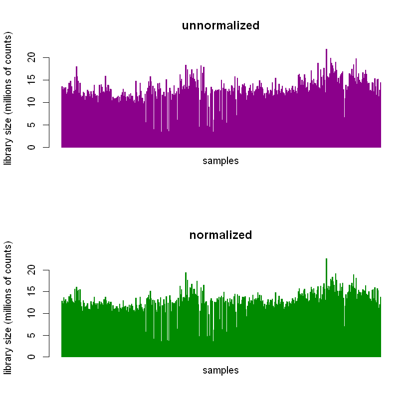
It’s easier to see in histograms.
par(mfrow=c(2 ,1))
hist(lib_sizes,
     breaks=40,
     col='magenta3',
     border='magenta4',
     xlab='library sizes',
     ylab='samples',
     main='unnormalized')
arrows(17,40,15,30,lwd=2.3)
text(18.6,41.0,labels=paste('var = ', toString(round(var(lib_sizes),2))))

hist(effective_lib_sizes,
     breaks=40,
     col='green3',
     border='green4',
     xlab='library sizes',
     ylab='samples',
     main='normalized')
arrows(17,40,15,30,lwd=2.3)
text(18.6,41.0,labels=paste('var = ', toString(round(var(effective_lib_sizes),2))))
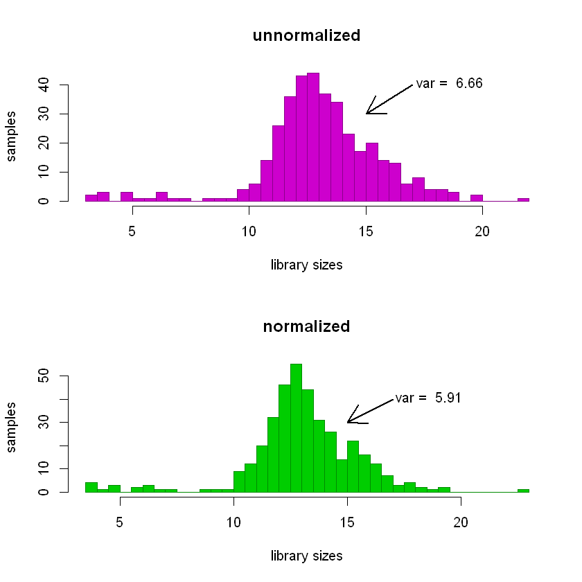
The variance of the distribution of unnormalized library sizes (top panel below) is greater than that of the normalized ones (bottom panel).
I’m obviously leaving out a lot about TMM normalization. For more detail about it, check out the original 2010 paper by Robinson & Oshlack.
Visualizing genetic profiles using multidimensional scaling
Sweet! What’s next?
So now we have our filtered matrix of gene expression counts and have normalized for technical variations among the 377 samples. We can think of our samples as points in a 22,377-dimension space (that’s the number of genes we have left after filtering). To visualize any relationships between them, we’ll have to transform the samples from the original space into meaningful lower dimensions.
What is multidimensional scaling (MDS)?
Multidimensional scaling is a way of examining the similarity (or dissimilarity) among samples/observations. It has some things in common with principal components analysis. The version of the plotMDS function available in the edgeR library is designed to first compute a measure of differential expression (for example, the \(log_2\) fold change in “Dementia” samples versus “No Dementia” samples) for each gene. Then, using a subset of the most differentially expressed genes (the default is the top 500), it computes the distance matrix between samples. It uses a ‘centered’ version of that distance matrix in an eigenvalue decomposition.
What MDS can and can’t tell us
I really like the example in the Wikipedia article for MDS of the kind of problem MDS is good for. Basically, if you’re given the aerial (or ‘as the crow flies’) distances between cities, you can use MDS to discover their coordinates on a map. And while you can’t use MDS to make conclusions with respect to the original, super-high-dimensional space, you can use it to infer something about the similarity/dissimilarity between samples. That is: samples that are closer together in the MDS plot are more similar to each other than samples that are far away.
Why do it for this project?
Again, the ultimate goal is to look for genes (or groups of genes) whose expression levels might be good predictors of dementia. One problem is that, even after filtering, there are still 22,377 potential predictors. Including those 22,377 predictors, all potential interactions, and a constant, that’s \( 2^{22,377} \) potential terms in a final linear model of dementia status, even before adding in the other predictors we have. Obviously, we need a way to limit that.
Another issue is biology, and the fact that differences between samples that we already know about are likely to dominate. Put another way, things like the donor’s sex or the region of the brain that was sampled are likely to account for the majority of differences between expression profiles. If that’s the case, we should see evidence to that effect in the MDS plots. If we do, I might be better off splitting the gene expression data up into those groups (males and females, different brain regions) and looking for differentially expressed genes within them.
Phew! Still with me? :) Ok!
Let’s do the thing. We’re going to store the results of the plotMDS function in the variable logFC_500. We’ll use the \(log_2\) fold changes as the measure of differential expression and use the top 500 differentially expressed genes for the distance matrix. We have the option of telling it how many dimensions in the transformed space to give us coordinates for; I’m choosing ndim = 4 here. Keep in mind that, much like PCA, most of the differences between expression profiles will be captured in the first few dimensions.
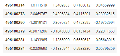
The coordinates for the samples in the four new dimensions are stored in logFC_500$cmdscale.out. plotMDS automatically outputs a plot of the data in the first two dimensions.
logFC_500 <- plotMDS(norm_counts,
                     method = "logFC",
                     top = 500,
                     ndim = 4)
head(logFC_500$cmdscale.out)
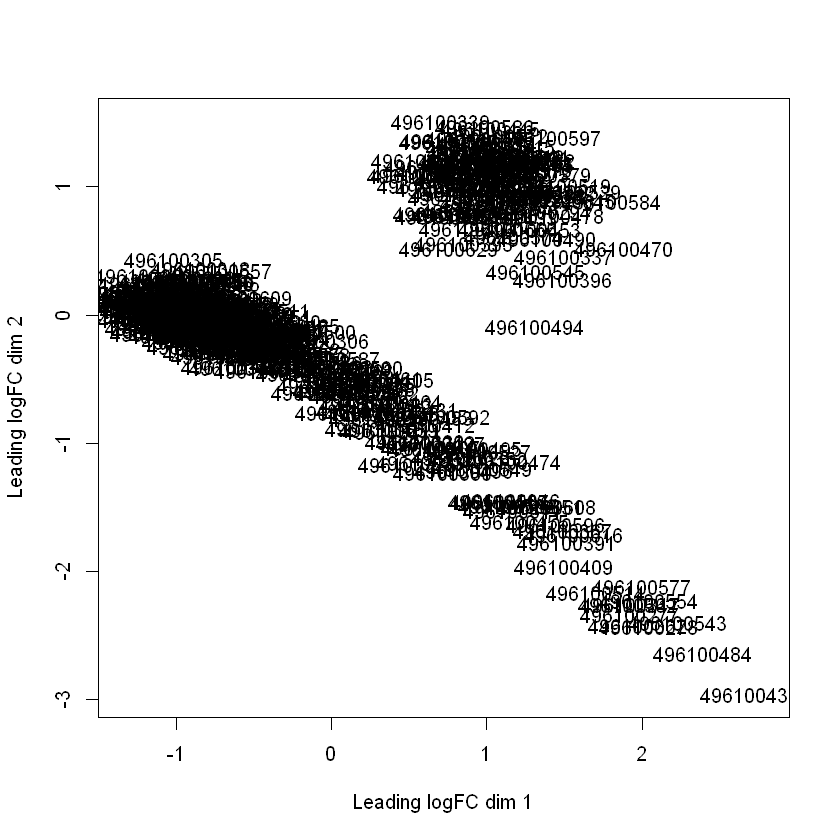
Interesting, right? The gene expression profiles form two separate clusters in these first two dimensions.
Using the plotly library, I was able to create 3-dimensional plots and shade the points according to sex and brain region. plotly let’s you do things like rotate plots within a notebook. I’m posting some static shots here (below the code blocks).
EDIT: Check out some interactive versions here
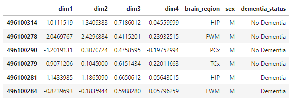
# make a dataframe with 4D coordinates + brain region, sex, & dementia status from sample_info
for_plots <- data.frame(logFC_500$cmdscale.out)
colnames(for_plots) <- c('dim1','dim2','dim3','dim4')
for_plots$brain_region <- sample_info$structure_acronym
for_plots$sex <- sample_info$sex
for_plots$dementia_status <- sample_info$act_demented
head(for_plots)
plot_ly(for_plots,
        x = ~dim1,
        y = ~dim2,
        z = ~dim3,
        color = ~sex,
        width = 700,
        height = 700) %>%
add_markers() %>%
layout(scene = list(xaxis = list(title = 'dim-1'),
                    yaxis = list(title = 'dim-2'),
                    zaxis = list(title = 'dim-3')),
       title = 'MDS Plot, Shaded by Donor Sex')
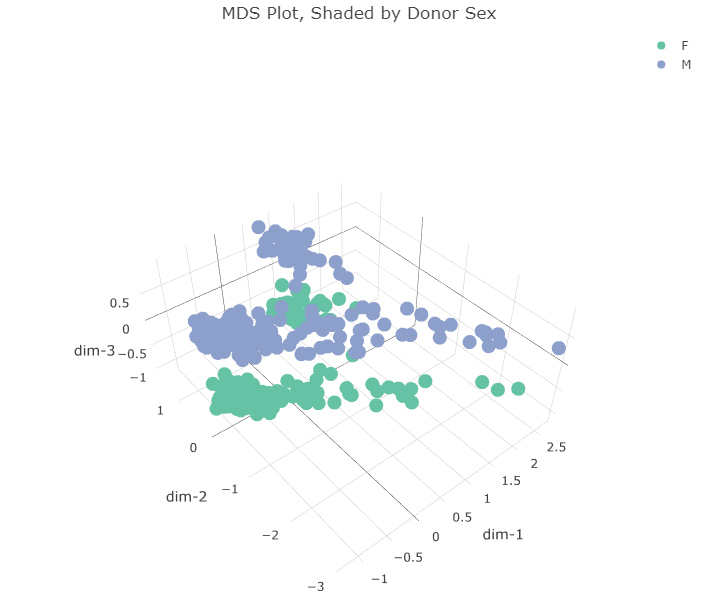
Plotting in the first 3 dimensions reveals that the two clusters in the first two dimensions can each be split along a third dimension. This third dimension appears to separate gene expression profiles according to the sex of the donor. What about the first two dimensions? Do they correspond to anything already present in the dataset? I made the same plot but instead shaded the points according to the region of the brain the sample came from.
plot_ly(for_plots,
        x = ~dim1,
        y = ~dim2,
        z = ~dim3,
        color = ~brain_region,
        width = 700,
        height = 700) %>%
add_markers() %>%
layout(scene = list(xaxis = list(title = 'dim-1'),
                    yaxis = list(title = 'dim-2'),
                    zaxis = list(title = 'dim-3')),
       title = 'MDS Plot, Shaded by Brain Region Sampled')
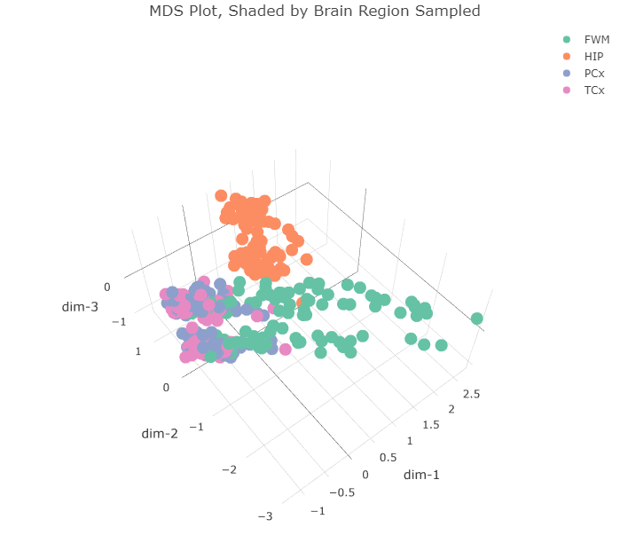
The four regions of the brain in the dataset are:
- FWM = forebrain white matter
- HIP = hippocampus
- PCx = parietal cortex
- TCx = temporal cortex
All the hippocampus samples (orange) form that tight cluster in the first two dimensions. The other brain regions all cluster together in the bigger cluster, with the forebrain white matter samples (green) forming the long tail. I wonder if that cluster separates further along the fourth dimension. Let’s plot dimensions 2, 3, and 4.
plot_ly(for_plots,
        x = ~dim2,
        y = ~dim3,
        z = ~dim4,
        color = ~brain_region,
        width = 700,
        height = 700) %>%
add_markers() %>%
layout(scene = list(xaxis = list(title = 'dim-2'),
                    yaxis = list(title = 'dim-3'),
                    zaxis = list(title = 'dim-4')),
       title = 'MDS Plot, Shaded by Brain Region Sampled, Dims 2-4')
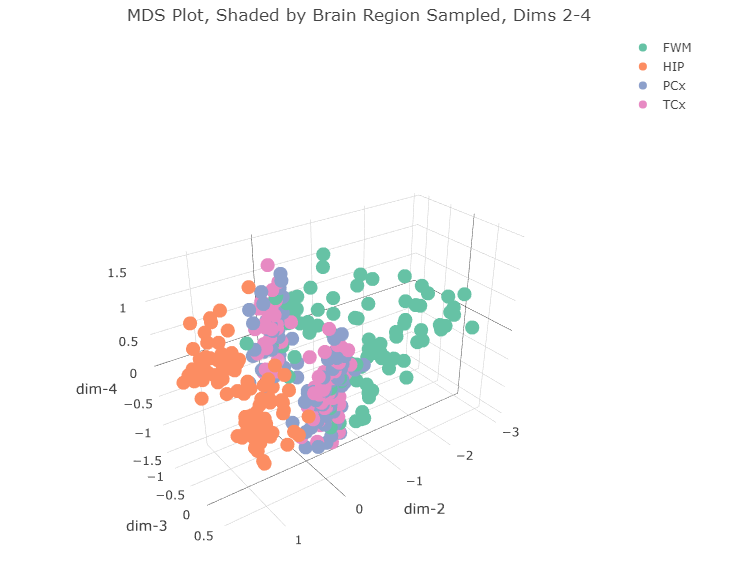
There doesn’t appear to be any clear separation of the data along the 4th dimension.
Below is the plot in the first 3 dimensions, shaded according to dementia status.
plot_ly(for_plots,
        x = ~dim1,
        y = ~dim2,
        z = ~dim3,
        color = ~dementia_status,
        width = 700,
        height = 700) %>%
add_markers() %>%
layout(scene = list(xaxis = list(title = 'dim-1'),
                    yaxis = list(title = 'dim-2'),
                    zaxis = list(title = 'dim-3')),
       title = 'MDS Plot, Shaded by Dementia Status')
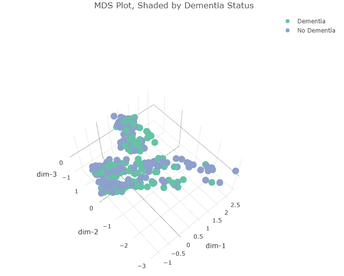
We can see that “Dementia” and “No Dementia” samples are pretty evenly split between the two major clusters in the first two dimensions as well as between males and females.
Conclusions & Next Steps
This was very revealing and not at all what I expected. When I first saw the two clusters in the first two MDS dimensions, I immediately thought they would be expression profiles from males and females, but that was not the case. The profiles do separate based on the donor’s sex but along the third dimension.
It’s interesting that the expression profiles from hippocampal samples appear so dissimiliar from the other samples. I’m afraid comparing the expression patterns in those samples to others could be a bit like comparing apples and oranges. Using “biological coefficient of variation” (BCV) as the measure of differential expression (instead of logFC) or different filtering conditions doesn’t seem to alter the clustering results that much. So, for next time, I’ll split the gene expression data up according to the region of the brain the sample came from and perform the rest of the differential expression analysis within those groups.
Until then, thanks for reading & happy coding, friends!
